PHOTOGRAPHY COMPOSITION: THE DEFINITIVE GUIDE
This article summarizes all my knowledge, experience and 6 months of work. I believe, anyone, newbie or pro, could find some new useful info inside of it. There are already hundreds of articles, dozens of guides. And some of them are really good. However, there was still a need for the comprehensive composition guide nicely presented and easy to follow. I did my best to keep it simple, concise and easy to understand with lots of goodies to download for future reference. Also, I keep it as short as possible with zero fluff for such a massive amount of material. Less talk, more practical info with examples, charts and graphs.
Side note: Most of the time I shoot landscapes and, therefore, most of my examples are some nature scenes. While street photography or portrait photography have their own specifics, they still follow the same composition principles. I believe this guide can be easily interpolated for whatever other genres you shoot.
TABLE OF CONTENTS
- Why Composition Is Important
- Painting vs Photography Composition
- Composition Concept and Principles
- Composition Techniques
- Composition Building Blocks
- How To Control and Affect Composition
- How To Improve Composition in Editing
- Bonus #1: Dynamic Symmetry – Myth or Reality
- Bonus #2: Composition Decision-Making Flowchart
- Bonus #3: Simplified Composition Decision-Making Flowchart
- Final Word
WHY COMPOSITION IS IMPORTANT
Let me ask you a question. Have you ever had a chance to tap on the piano or play the guitar? What happens when you randomly hit the keys or strings? I bet it produces something you can’t call music and it hurts your ears. Meanwhile, a set of same chords properly aligned creates something beautiful and meaningful. Another example is a total mess in the room. It’s hard to find anything; it’s hard to walk through. While the clean room with adequately arranged items brings a sense of harmony and it’s easy to navigate. The final example is a human body. Its composition ensures functional abilities and beauty.
The same principle is for all visual arts including photography. Proper layout of elements creates a sense of harmony, movement, tension – whatever you want. Composition speaks a thousand words, tells a story, encourages the viewer to scan your photo, to stay in it.
PAINTING VS. PHOTOGRAPHY COMPOSITION
Both painting and photography are visual arts. They are similar in many ways, but there’s one huge difference. For the painting, an artist can have weeks and months for sketching out a future masterpiece, can build a perfect complex composition verifying and calibrating each step, each tree, each wave position. We do not have these vast opportunities to make everything perfect. For some photography genres, like portrait, macro, still nature we can take our time to build compositions, while for the landscape photography we take whatever Mother Nature gives us, and we need to decide fast while the light lasts. And it’s even worse for street and sports photography; sometimes a photographer has a split second to decide.
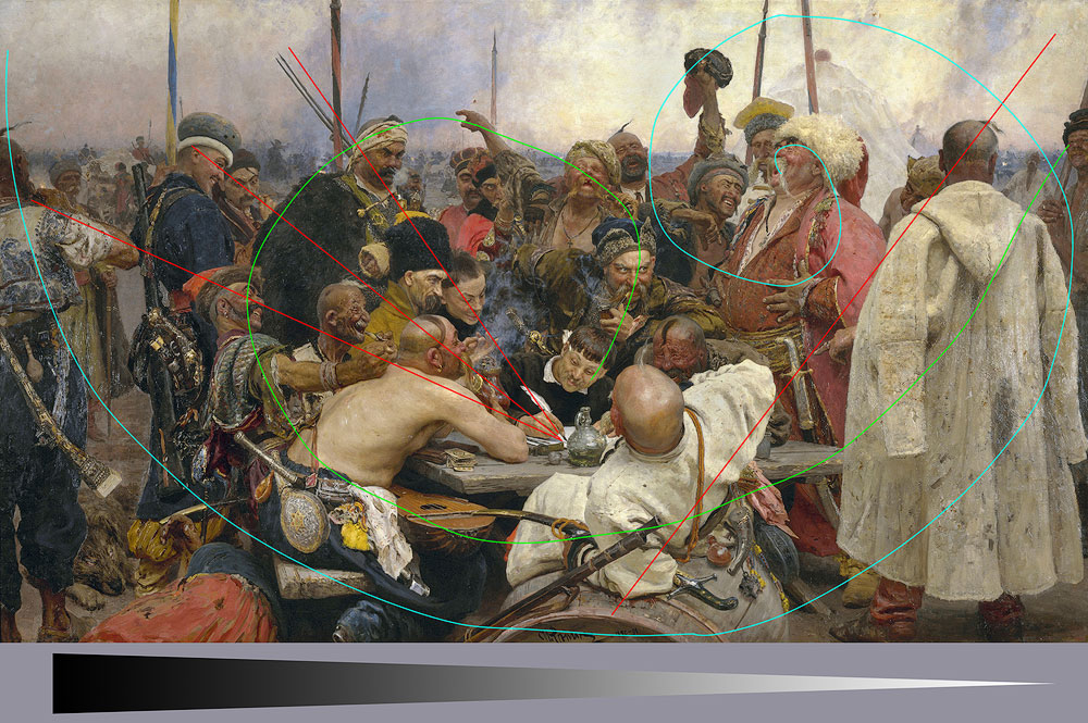
As you can see, as a general rule, a photographer has much less time than an artist to decide on the final look of the photograph. That is the reason to take an extra shot or two just in case you missed some aspect with the first one.
COMPOSITION CONCEPT AND PRINCIPLES
Before going deep into the techniques, we need to understand what the composition actually is, how it is created, what key points it has, how it affects our perception and what its capable of.
FRAME SHAPE
Obviously, we need to start with the frame shape as it is the first thing affecting the photo and the general perception. Historically, frame shape is rectangular, and I want to speak more about the aspect ratio. The most common aspect ratio is 3:2 and it comes from the sensor size (and previously film slide size) 36 x 24mm. The reason for the frame to be horizontal is obvious – that’s how we see things due to the eyes position. I’m not aware of any good reason for the exact 3:2 measures and 4:3 (shorter) seems to be more natural. I believe, 2:3 could be a better ratio for the portraits due to the elongated body shape, and that’s the only valid reason for that.
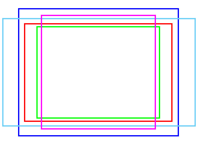
The most challenging frame to shoot is square. By its nature, it is very stable and has zero dynamics. So, you should have a perfect reason to select a square format for your shot. The subject should be very stable by itself of lack any dynamics. The good example would be some patterns or something symmetrical.
VERTICAL AND HORIZONTAL ALIGNMENT
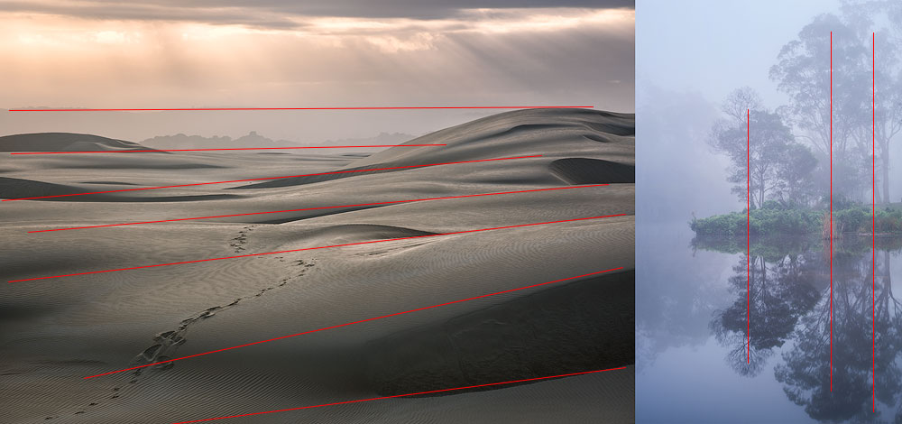
The rule of thumb is to choose a horizontal frame when the majority of the compositional lines are horizontal and vice versa. Sometimes you could do the opposite to increase tension, i.e., include a vertical subject, In this case, make sure to leave a lot of breathing space around it.
FILL THE FRAME
This filling principle is easy to understand and implement. You have a frame, and all of it should work for your story, for your image. Try to arrange elements in a way that doesn’t make part of the photo crowded and another part empty. This concept also applies to the size of the items. Try to use the whole area you have at disposal, not just a fraction of it. Take it this way – if you cut any part of the photo and it looks better and more harmonious, then you haven’t filled the frame.
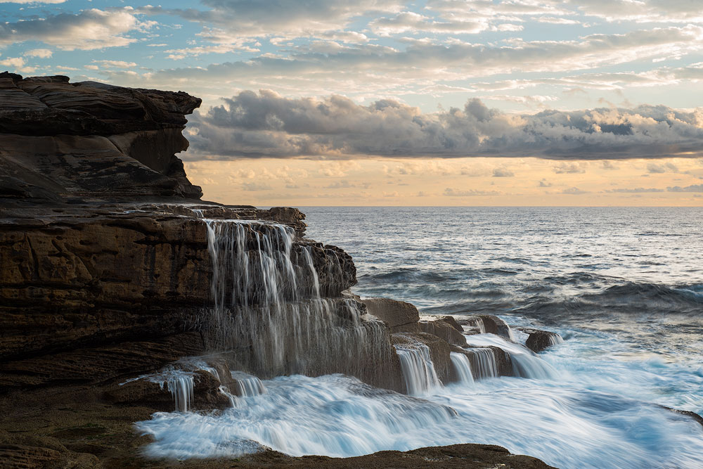
The critical notice here – don’t put anything bright or dark or contrasty very close to the edge as the visual weight increases towards the edges. It applies to any distracting shapes. The closer to the side the more attention it’s going to get due to the way our eyes scan the image.
Another bad idea is to position vertical lines near the vertical edges or horizontal lines near the horizontal sides. Their visual weight increases as well as distracting from the main subject.
VISUAL STORYTELLING
Storytelling is the whole point of any photograph. We saw something, and we want to tell about the subject or the story it conveys to the viewer. If it has nothing to say or communicate, it’s a snap, not a photograph. This whole guide is about different means of visual storytelling. Like, you start to read a book from the beginning to have a clue what’s going on. There are specific writing rules or structures, like linear narrative, nonlinear narrative, it should have a plot, etc. Same thing in visual arts and photography in particular. You need to have a subject, a context and a layout. All these things plus many more form your visual narrative. So, treat composition as a storytelling tool.
Please examine an example below and note how the crop affects the story it tells. Try to figure out what’s the plot in every final picture.
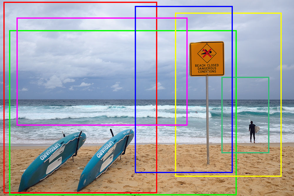
What’s the catch here? The thing that changes is the context. The context gives us a story to tell.
I’ll throw in a few examples along the way too.
POINT OF INTEREST
First and foremost, identify what your photo is about, who’s the hero, the main subject. It can be some object, like a tree, it can also be a mood or a feeling. There was something that triggered you, forced to take out the camera and peer into infinity visualising a future shot. You are building a whole story around this subject. The point of interest can really be anything, a human, an animal, a feeling, a mood, a relation between some secondary objects, a colour, a pattern, a rhythm, etc. Don’t limit yourself to something solid.

BREATHING SPACE
The first thing you are going to wonder is where to put the main subject. Let’s start with a simple scenario of something solid. Before we jump into the multitude of composition rules and techniques, we need to talk about the general positioning within a frame. One of the most fundamental rules is to give your subject a so-called breathing space. Except on some rare occasions, it has to have some area around it not blocked by other objects or, more importantly, frame edges. An object starts to visually suffocate if it (or any part of it) is too close to the side. The scanning eye trips over such positioning, and smooth experience is broken. You can manipulate the amount of breathing space for specific effects, but we’ll discuss it later.
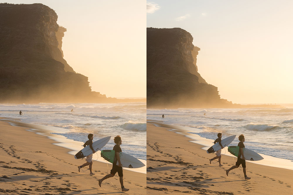
CHECK THE CORNERS
Just like with positioning high contrast objects near the frame edges, the corners are even more critical. Always check the corners before pressing a button and avoid anything distracting. Any object near the corner immediately drags an enormous amount of attention, and the eye keeps jumping back to it. The key to the composition is simplicity and clarity.
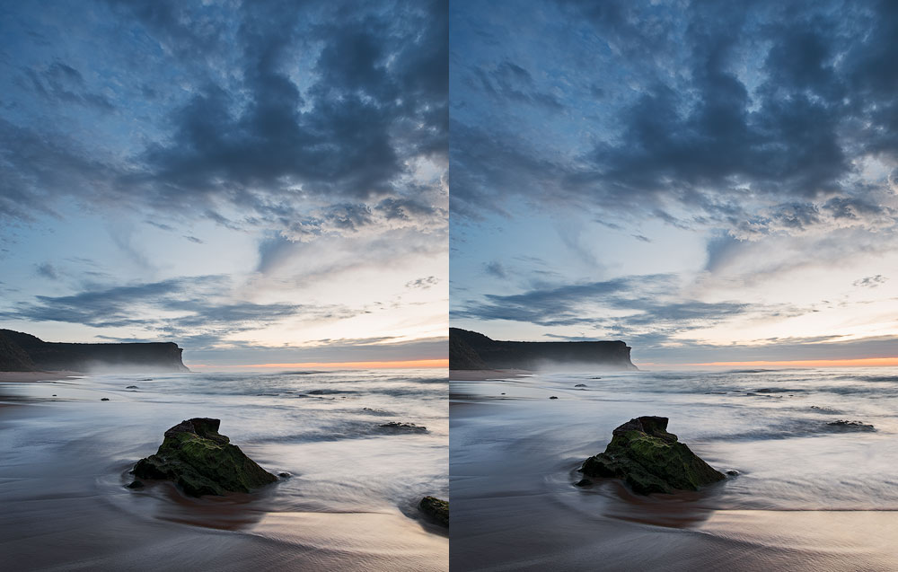
CHECK THE BACKGROUND
It’s not the police background check, but it’s also essential. I know, this sounds obvious and most likely you know this info already. But looking at the photos posted by amateurs, I must repeat it. Check the background. Make sure your main subject is separate from any background, make sure it stands out and is clearly visible. Make sure there is no branch sticking out of the head, make sure no items are interacting or blending with the main point of interest.
SIMPLIFY
Take it this way – if it doesn’t add to the story, exclude it. You got it right – include as little as possible.
In fact, to build great compositions, you must learn to exclude with no remorse or regrets. If something is distracting, competing, overly bright, etc., remove it. Go for the clarity. There are certain things you’ll be able to remove later in Photoshop, but sometimes it’s easier to exclude it in the first place during shooting. This process of eliminating things is known as Subtraction, when you subtract everything unimportant or distracting or competing with the main subject. Always aim to include as less as possible.

It goes down to a convenient property of our eyes to filter out a lot of things. We somehow learned over the years to focus our sight instantly on something exciting and ignore the rest. This ability doesn’t apply to the visual arts. Therefore we must remove everything that our eyes would filter out automatically and help the viewer to grasp the concept of your photo in the first couple of seconds.
BALANCE
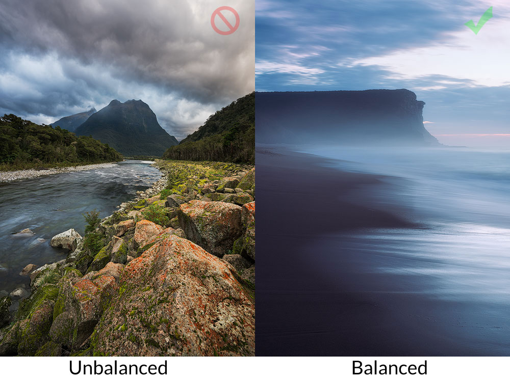
Composition balance is a tricky concept. More often than not, you’ll want a balanced shot. Sometimes, however, out of balance composition can deliberately increase the tension, the expressiveness and convey some idea in a better way. Usually, it’s easy to measure the balance just by looking at the photo.
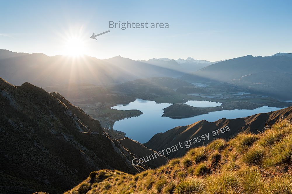
Ask yourself a question – is it balanced or does it fall to the side? The “heavy” elements are dark, bright, high contrast areas, saturated zones. You can easily balance a dark mountain peak with a bright coloured cloud, for instance. The actual weight of the element isn’t relevant in this case; we care about its significance in the shot and the proximity to the centre. The visual weight increases as the element travel further from the centre, hence the rule I mentioned before, where you don’t want to put any “heavy” objects near the frame edges or corners unless you are trying to balance something far bigger.
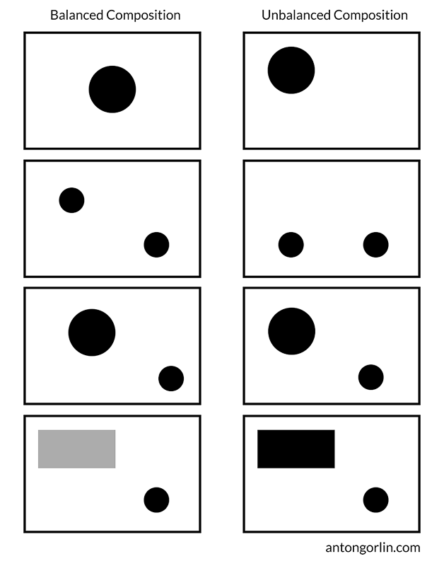
The bigger object you include in the scene, the harder it is to balance it with something. Sometimes a massive rock on the foreground chokes the whole photo. So, the balance also applies to the object-to-scene relation.
Please note, this is important for understanding, balance is not opposite to dynamism. Balance is contrary to off-balance. The decision to make a balanced or unbalanced shot is entirely up to the creator as they have a different influence on the viewer.
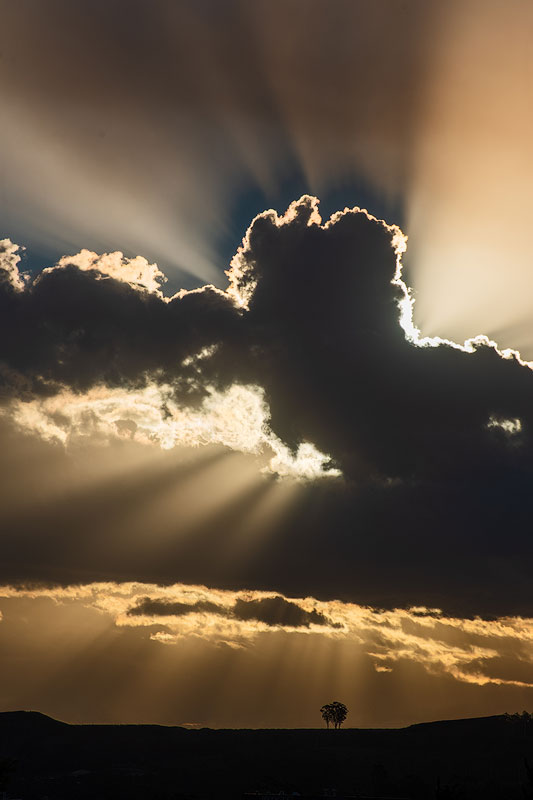
STATIC BALANCE
Static balance is created by same or similar objects located at the same distance from the visual gravity centre of the frame. You can have a red cloud on one side and a robust dark tree on the other side, and they’ll balance each other.
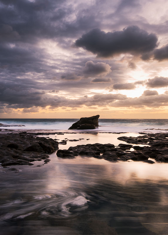
DYNAMIC BALANCE
Dynamic balance is created by two completely different in size objects positioned at different distances from the centre. Such difference establishes a balance.
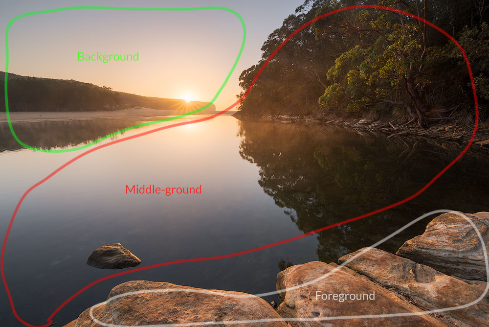
FOREGROUND, MIDDLE-GROUND AND BACKGROUND
These “grounds” are a basic way to subdivide the photograph. This segregation is essential and must make its way into your subconscious. The photo is a transformation of the 3-d world into the 2-d image. As we project 3-d objects onto a level surface, they lose a whole dimension, and that’s why it is essential to use every single way to add volume and three-dimensionality back to it. The first thing is to have three layers of your photo – foreground (everything close to the photographer), background (the most distant objects, i.e. distant mountains and the sky) and middle ground (everything in between).
WHY THREE LAYERS?
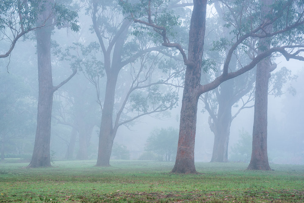
If we have just one layer, it may look flat and dull. If we have two, they could compete with each other. Three will allow the viewer to look smoothly deeper and deeper into the shot. However, take a telephoto lens and zoom heavily in the green hills with some trees and make a shot. There is just one distant plane with everything in it. This one is a special case, where it works. Another excellent example of the reduced number of layers is when the landscape is very graphical, like the foggy morning. In the photo where competition is part of the story, feel free to include two layers to emphasise it.
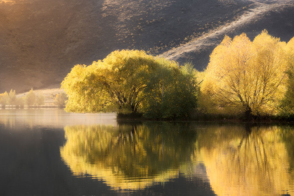
PHOTO LAYOUT EXAMPLES
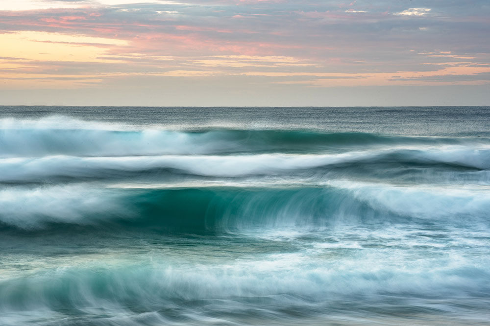
For instance, for a seascape, in a classical approach, you’ll include some distant cliffs and a sky as a background, the sea as a middle ground and the rocks or the beach as a foreground. Another way to approach it is to zoom in and have a wave as a foreground object with little to no middle ground. You could also go into the water and capture some water motion as a foreground.
COMPOSITION TECHNIQUES
We made through the composition concept and general implementation principles. Looks like, it’s time to go deeper and get to know the actual rules and techniques that you can implement for instant results. Some of the methods could seem to contradict each other but that only means you can’t use them both at the same time. I’ll tell you more; you don’t have to use anything out of these if your sense of harmony whispers against it. Listen to your heart and to the Harmony inside of you to produce the best images.
I have to warn you – none of these techniques will make you a great artist. Practice and study will. How many years do musicians study? How many out of them become composers? Not to mention being a great composer. That’s the whole point, in the current era of digital cameras and Photoshop, one can learn to produce good pics in less than a year. But it doesn’t mean those pics have a right and meaningful layout. 99% of photographers stop at the Rule of Thirds and Diagonals. Those two are enough to do OK shots and focus on editing, but there’s a whole science to master all of them.
In this chapter, you will see a lot of layouts, grids and techniques. At the basic level, you’ll need to structure your photo in such a way that important lines are near the grid lines and the main subjects are somewhere near the intersection of the grid lines.
Important note: in landscapes, more often than not, the horizon is one of the significant lines that you should put somewhere near the grid line. But that isn’t always true, and the horizon can sometimes play a less critical role in the overall layout. Use your images.
LEADING LINES
A leading line is a line that makes the viewer’s eyes follow it. It tells us a story, leads our eyes across the image and helps us to understand it. Essentially, every single line covered in this chapter is a leading line, it’s a basic concept of any composition. There are numerous ways to form a leading line. The most basic one is just some solid line, like a fence or a cliff face. The more advanced one is a broken line made of separate objects, which suggest a line between them. It’s better to have at least three objects for a more prominent repetition. We’ll cover the other advanced ways to form the leading lines later in this guide.
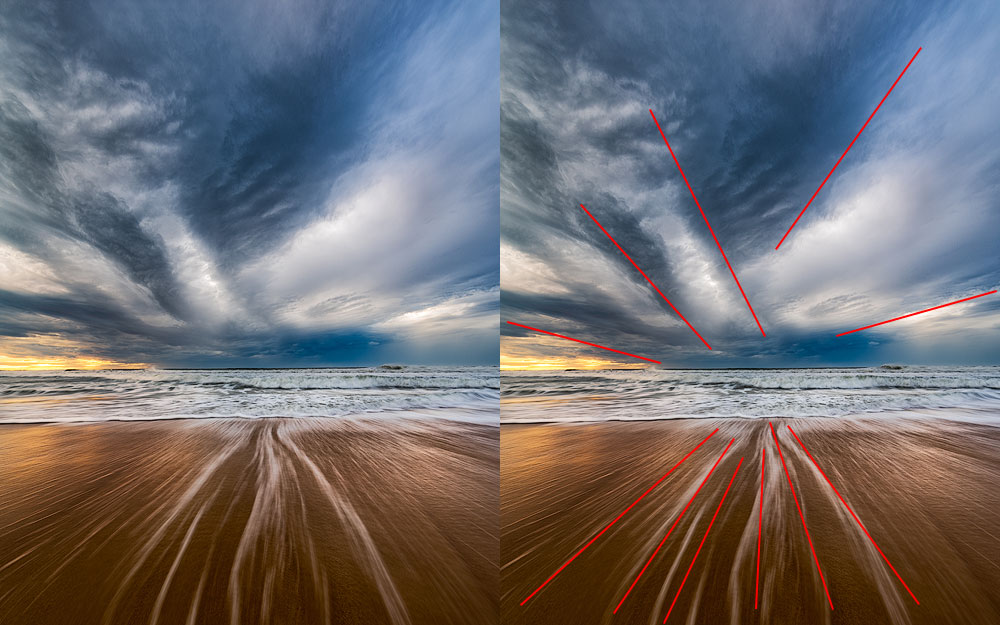
A critical note here: do not split the frame with a line in two. Most of all it applies to a vertical line in the middle of the shot. The lines should “stay” within the photo and shouldn’t lead the viewer’s eye out of the frame.
TENSION AND STABILITY
Lines, parallel to the edges (vertical and horizontal) add a sense of stability to the scene. Diagonals and triangles add dynamism and tension. Our eyes have a habit of seeing everything in horizontals and vertices. The land is horizontal, and the walls are vertical, that’s what we see all the time. The rectangle is the most used shape in the world. That’s why when we see a diagonal, we feel some tension as if we wanted to stabilise it, to prevent it from falling. Simultaneously, it adds volume to the picture. Triangle is a geometric shape that has multiple diagonals and a feeling of perspective hence adding even more dynamism. It is possible to build the entire picture made of triangles, and such an image will look dynamic and lively. In general, it’s a good idea to use geometric shapes in photography and triangle is the most dynamic of them.
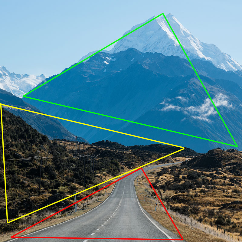
Take this: vertical and horizontal lines add stability, diagonal lines add dynamism. The best part of it is that you can have any number of lines in your shot as long as they all play together. If you want a serene, calm, soothing photo, don’t add a lot of dynamics to it. If you want a lot of action and energy, add diagonals and triangles.
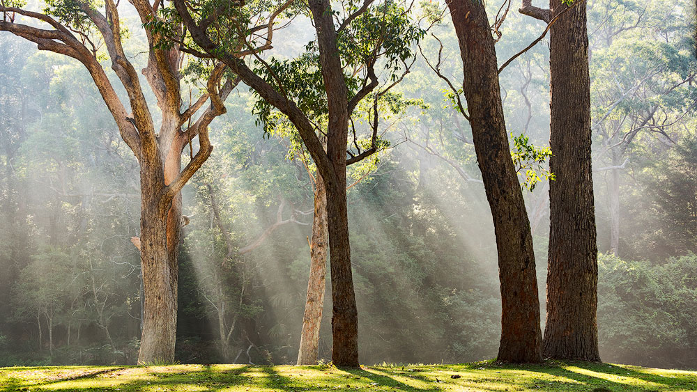
DIAGONALS
Creating diagonals is easy and straightforward. Diagonals are everywhere, always look to include some in your shot. A slight change of angle transforms a horizontal line into a diagonal, and the viewer will eagerly follow it with their eyes. Be careful, don’t let it lead the viewer out of the shot, make them wander within. The most obvious usage is to have some significant subject somewhere in depth of the shot and have a few diagonals leading right to it. The diagonals work best when they start from the corners.
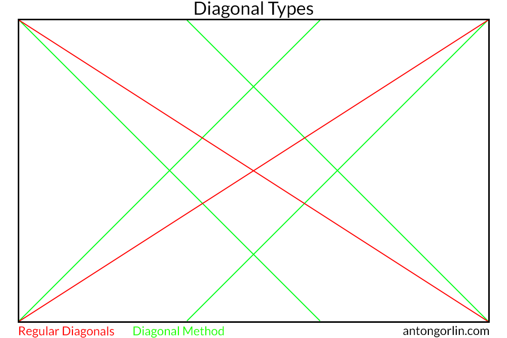
There are two ways to place diagonals in the image:
- The most obvious way is from one corner to another. This way we have only two lines in the end.
- The so-called Diagonal Method suggests diagonal lines from each corner coming out at 45 degrees. This way we have four separate lines forming a rhombus in the centre. The critical fact here is that Diagonal Method does not give any additional value to the intersections and objects can be placed anywhere on four bisections. However, unlike other rules, this one is strict about putting elements precisely on the lines with next to none deviation.
ASCENDING/DESCENDING DIAGONAL
The way the elements are organised within a shot affects how we perceive it. For the majority of people in the world, the eyes scan the picture left to right. That’s how we read and write and that’s how we look at things. Even if something drags our attention in the middle of the shot, we still go back and scan it left to right afterwards. In fact, I’ve heard some photographers dispute this concept, but I found it to be right at least for me. And that should be enough to mean it is right for some people.
Ok, so what does it mean for the composition? Let’s assume we have a slope. We can show it in two ways – as a challenge, as a tough hill, someone should conquer, or as a smooth descent. Our body will react accordingly because we know both feelings – when we climb a tough hill or when we cycle down the road. Let’s take that slope and show both directions without any action on it.
For me, the first one means a challenge, and the second one expects an easy walk. What about you? Another way to read this is to treat descending diagonal as “negative” and ascending as “positive”. Any diagonal is both ascending and descending depending on where the viewer start to “read” it.
STORYTELLING EXAMPLE
Getting back to the Storytelling for a bit as such a slope gives us an excellent example to fantasise. Let’s put a standing person somewhere within a picture. And let’s not add a moving person because his posture makes the direction of movement obvious.
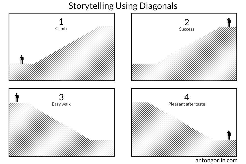
- The person is about to start a climb. A long way ahead.
- The person has made it! He’s at the top!
- He is about to go down, an easy walk ahead.
- He’s at the bottom, and it was a pleasant stroll.
Now you see that an incline and the direction gives us a context and we can produce the story immediately.
DIAGONAL TYPES
Here’s another take on the diagonal directions and their psychological meaning.
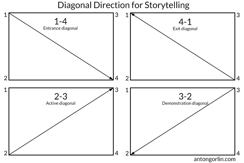
1-4 – Entrance diagonal. Good for the main hero to enter the frame.
4-1 – Exit diagonal. Likewise, showing a train going into the distance.
2-3 – Active diagonal. A good layout for the struggle to overcome like an uphill battle or a mountain climb.
3-2 – Demonstration diagonal. Something is showing off, like a protest or a march.
Take these into account when putting together your composition.
RULE OF THIRDS
Let’s start with this one to clear it out of the way. Rule of Thirds is typically the first rule newbies get to know about the composition. It is a straightforward and natural way to subdivide the frame. We split the photo as the name states into thirds producing a simple grid. The rule says to put the main subject into one of the intersections. If you have several points of interest, put them into different intersections. Luckily, you have four of them. Such positioning allows for the smoother eye scanning. Also, don’t forget to put important lines onto the grid lines. In fact, this grid shows us where to put the elements so that they have some visual relation, but doesn’t tell us how to add dynamism, how to connect the planes, etc. It’s a simple two-dimensional layout.
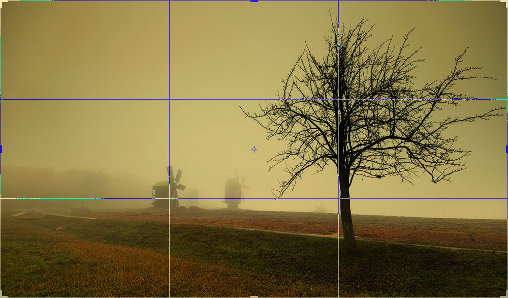
For the curious: Rule of Thirds originates from the Rabatment of Rectangle. This technique builds two squares for any aspect ratio rectangle. Believe it or not, for the regular 3:2 aspect ratio, this rabatment is precisely on the thirds.
GOLDEN RECTANGLE
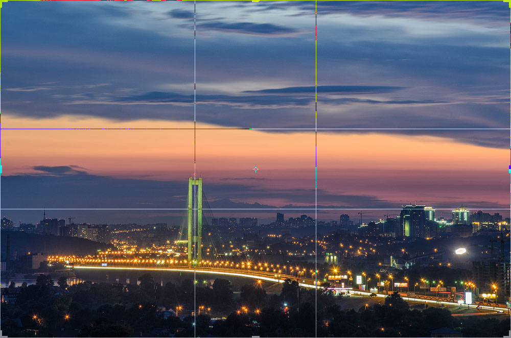
Golden Ratio has a long history. I don’t want to go into the calculations because it has been calculated thousands of times by artists and scientists in the past. If you really want to, you can read more about it in Wikipedia. The application that we can use is similar to the Rule of Thirds. The grid lines do not split the frame into equal parts because they are closer to the centre. The rule originates from natural proportions, a lot of things are built around the golden ratio, including humans, to some extent.
GOLDEN TRIANGLE
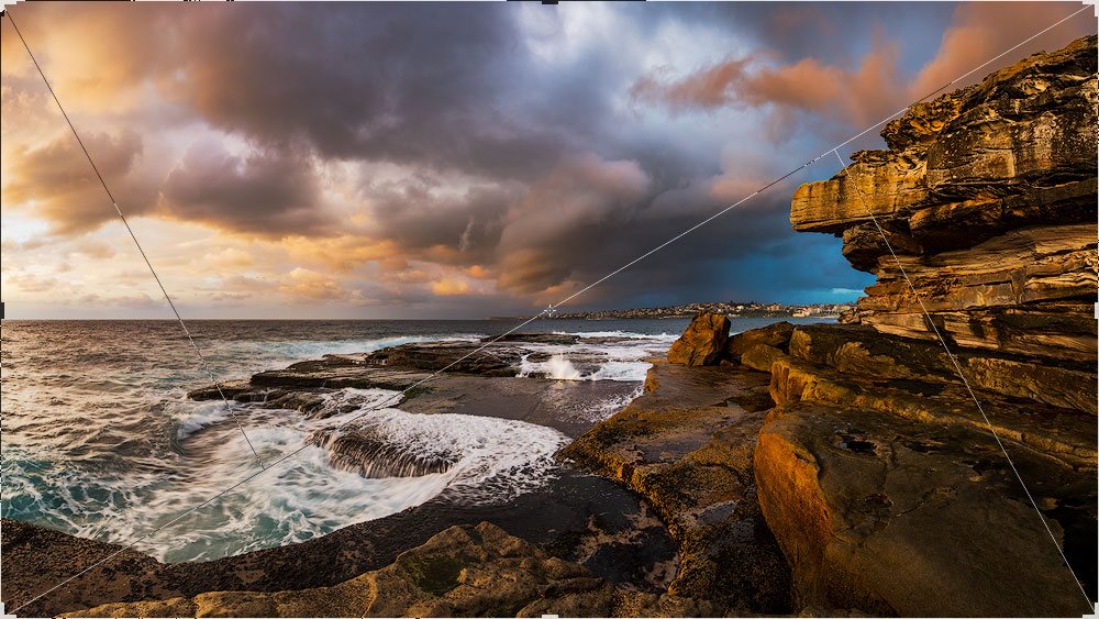
I’m not sure why this rule is called “Golden” as it has nothing to do with the Golden Ratio. Anyway, it’s easy to form the guidelines for it. Draw one diagonal from corner to corner and then draw two lines from the remaining corners so that they make 90 degrees angle with the main diagonal forming four triangles as a result. Like many others, this rule isn’t rigorous, and the objects you create should have a crude resemblance with the lines. Also, these triangles are not symmetrical, and you can flip it if you need to.
GOLDEN SPIRAL
Maths is amazing. When we look around, it may seem the world is chaotic and unorganised. But then we find yellow chamomile clearly showing spirals arranged with Fibonacci numbers. Or the human X chromosome inheritance tree also shows these numbers. Some galaxies are spiral, fetuses resemble it too. It’s fascinating to see a rule, which describes the way the world is organised.
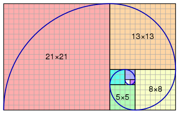
Golden Spiral is a self-repeating spiral shape with a constant growth ratio. Surely, no one will calculate these values precisely, especially when the sunset light is quickly fading. Luckily, this rule is not strict either, and the objects should roughly follow the spiral. Fibonacci numbers are one way to approximate the golden spiral. Lucas numbers are another. It doesn’t mean a lot to us, because the spirals look the same for the naked eye. Just follow the general principle.
The objects should form something resembling a spiral with a primary subject close to the small twisting point.
GOLDEN RATIO – MYTH OR REALITY
Every time I post anywhere about this ratio, I hear someone disagreeing. There is a lot of dispute about this topic. First of all, the golden ratio is believed to be at least 2400 years old. It is found in a lot of statues and even Pyramid of Giza. Of course, that doesn’t prove anything.
The main argument against it is saying that all humans are different, how can there be any constant harmony? That’s true, all human beings are different. But somehow we have that internal feeling – that guy has short fingers, the other one – long arms. What are we comparing to? We have that inner sense of harmony. And this ratio speaks Harmony. I believe there are some universal Harmony Rules and we have a candidate to describe this rule right here before us. No one is perfect, while the Golden Ratio describes perfect proportions.
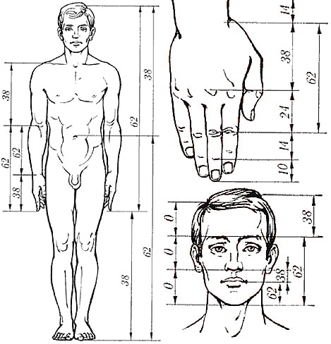
I feel that these ratios and rules correlate with a sense of Harmony I have built-in. And I have Leonardo da Vinci, Michelangelo, Raphael, Rembrandt, Salvador Dali, and others by my side and that’s quite a company.
Side note – the absence of harmony can also be pleasing for the viewer. The conflict and dynamism attract attention.
S-SHAPED CURVE
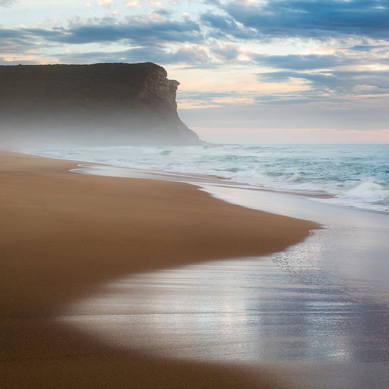
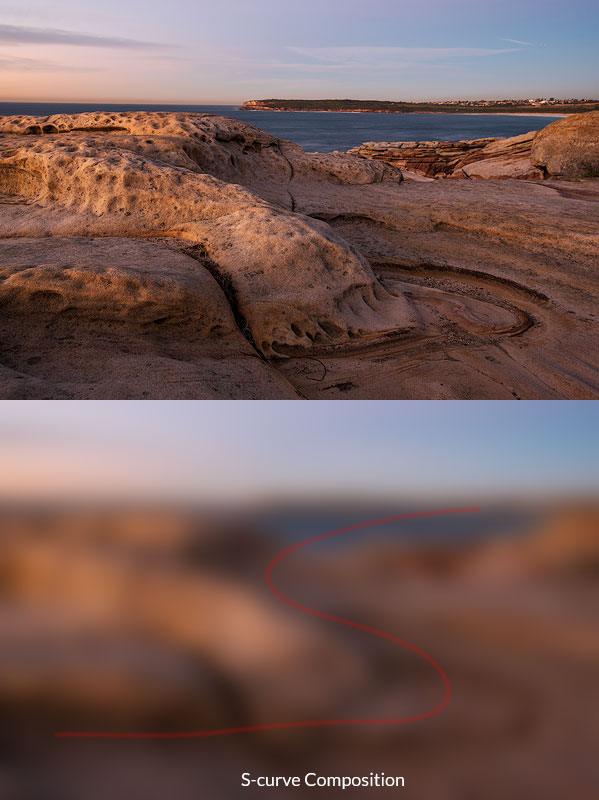
This shape is very dynamic and pleasing. It curves through the shot giving the ability to browse all parts and leading to the main subject. Unlike a diagonal, which is very direct and straightforward, the curve is more gentle and catchy. Such compositions look most natural, and the viewer has zero chance to escape the flow.
CONTINUOUS CURVED LINES
Such lines work particularly well for the S-shaped curve as well as any other rule. The general idea here is to keep the whole line within frame if possible. If the line goes beyond the frame edge, it stops being a good curve. You may think it’s still curved but that’s only your imagination and memory, it is unlikely the new viewer will recognise the original shape.
CENTRAL COMPOSITION
Every single guide to composition suggests for the reader to avoid central composition at all cost and put your subject into the grid intersections (using the Rule of Thirds, of course). But is it right? Absolutely not! You can safely put an object into the centre if the photo is about this subject solely and everything else is complimentary. As opposed to other rules, where we try to blend it into the scenery. Take this as a more centrist, egoistic approach. This composition, however, needs some strong composition lines pointing at your subject. It’s imperative to have just one subject (dark or having high contrast or saturation) for this type of shot so that it does not have to build relations with other objects. It must be the centre of gravity. Also, it’s nice to have some prominent symmetry around the subject.
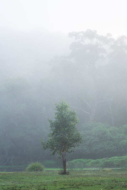
Another myth is that you shouldn’t put the horizon into the middle. This is true when foreground and background compete and are of equal weight. You can put it in the middle in the following cases:
- When one of the parts is significantly stronger than the other part. In this case, the visual centre will still be in the more massive part.
- When horizon is not one of your significant lines.
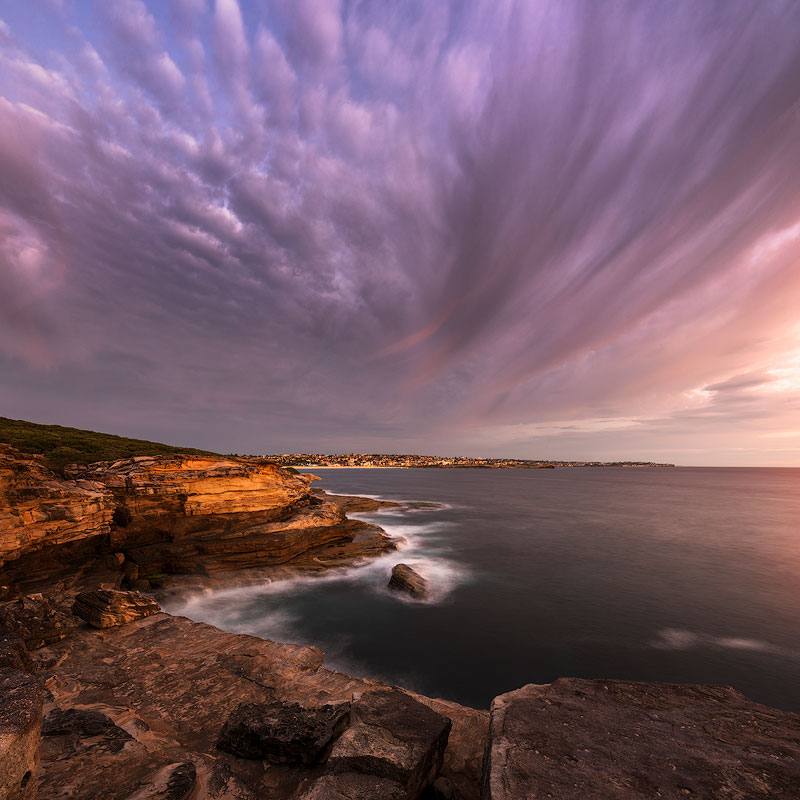
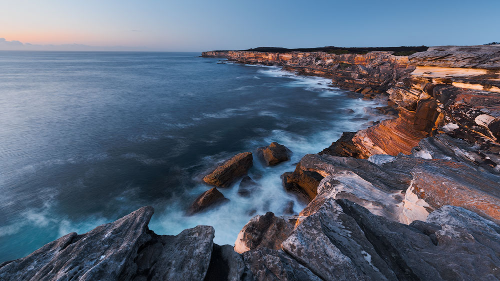
Horizon plays a secondary role here. The main leading line goes from the bottom right corner along the cliff edge and then continues into the clouds - Again, when you have symmetry. A good example would be a landscape with reflections.
- Panoramic shots. The prolonged shape of the pano adds weight to the bigger side. So, if you feel fine putting a horizon onto the top third for the regular 3 x 2 shot, the same approach for the pano makes the foreground overly heavy and chokes the whole photo. Put the horizon much closed to the centre.
SYMMETRY
Everyone knows what symmetry is. Look for it anywhere – architecture, reflections. Symmetry is closely related to the balance and to the way humans are made. Humans are symmetrical, and we have binocular vision, we have two parts of the brain, etc. Symmetry is everywhere. That’s why we tend to like it and to look for it. Symmetry is good for the central composition when the image is symmetrical relating to either vertical or horizontal line going through the image.
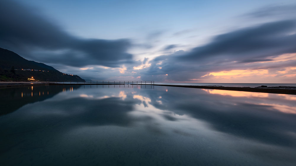
RESEMBLANCE
A very cool technique is to find a resemblance between entirely different objects. The key is to see similar shapes and accentuate them with the composition. Once you have noticed similarities, use other composition rules to build the photo. The more significant the difference between the objects the better is the visual effect. The resemblance could be straight or mirror can be of a different size but with the same shape. It’s fun to spot and a pure pleasure to photograph. The resemblance is somewhat similar to the Repetition (covered later in this article) but typically requires a more complex shape that is easy to distinguish between other forms.
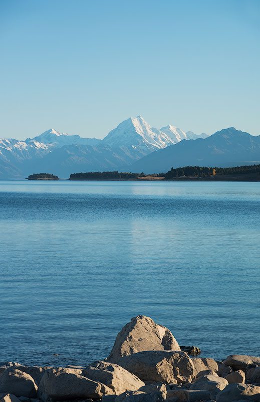
RADIAL COMPOSITION
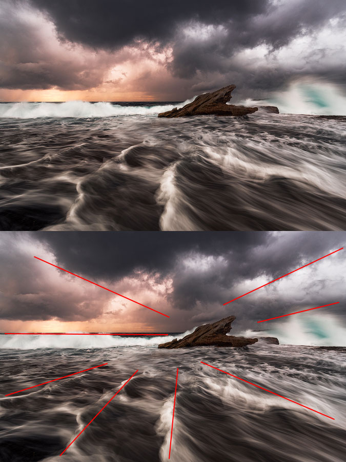
The radial composition is easy. In fact, it’s a sub-type of a diagonal composition with lots of lines and triangles. This particular shape has one main subject and a lot of lines pointing towards it. It is essential not to have any other centre of gravity or significant lines to make the effect even stronger. The whole layout resembles the Sun and the sun rays.
NEGATIVE SPACE
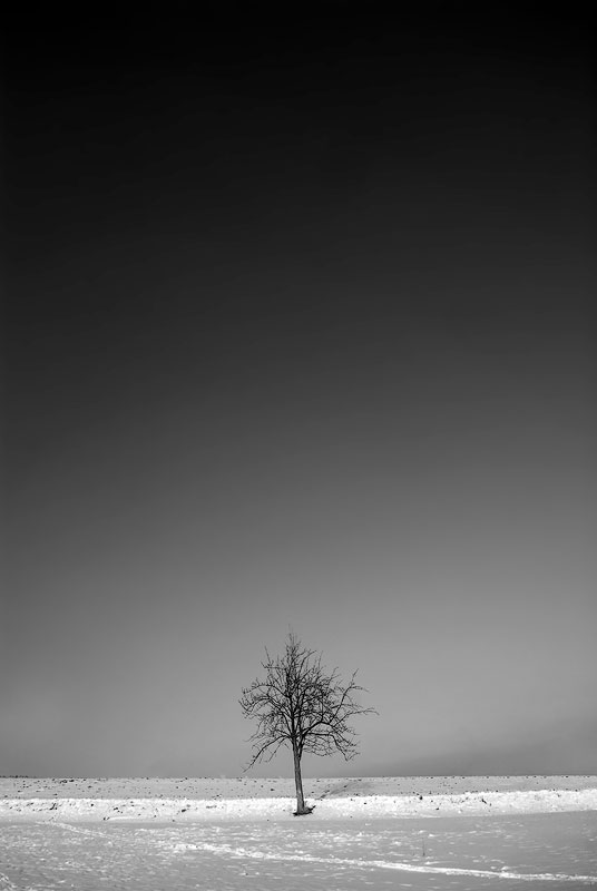
Remember how we discussed “Fill the frame” principle? This rule shatters the filling concept into pieces. We deliberately leave a lot of empty space around our hero to emphasise the feeling of the loneliness or emptiness or The Big Unknown or something similar. Sometimes, such a photograph can also convey a sense of smallness of human. Negative space is the perfect example of breaking the rules tastefully.
RULE OF ODDS
The rule of odds suggests that we find an uneven number of objects in the photo more appealing than an even number. The reason for that is again stability vs dynamism. The even number of objects suggests balance and lack of movement and of course, the bigger the number, the harder to spread attention between all subjects. Also, two elements imply competition, opposition, and tension, or just a dialogue. Three elements convey a story and produce a dynamic balance. There is always something in the middle surrounded by other items thus giving a visual anchor.
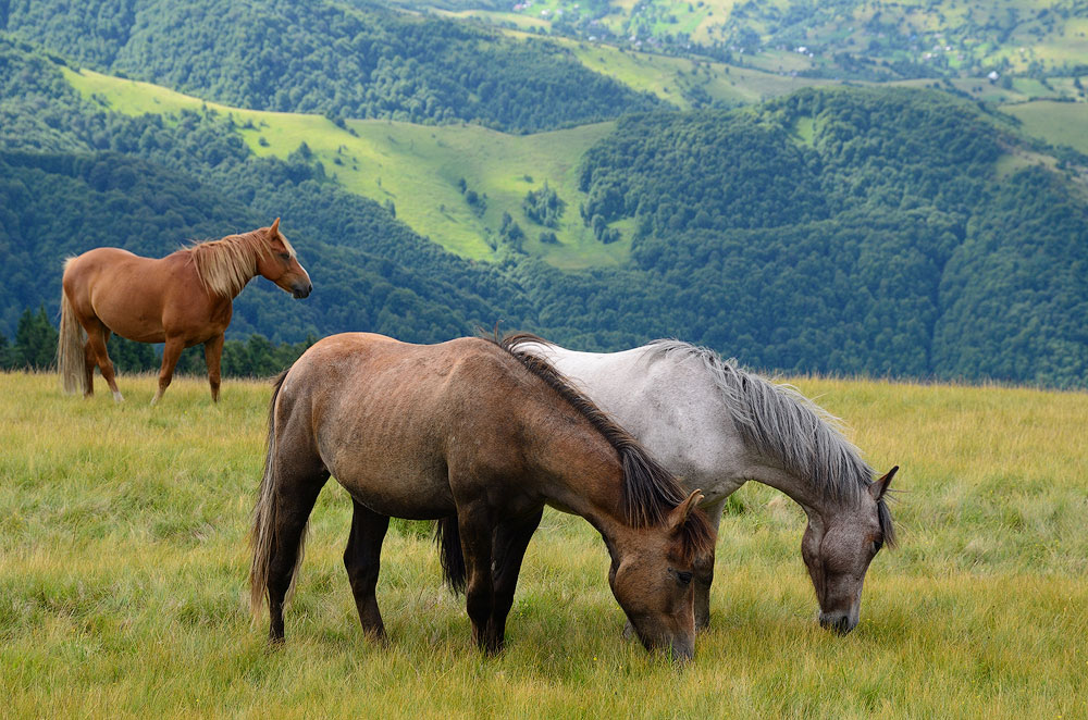
The rule seems pretty simple but is it the case? Can I include five elements? Should I add 27 people in the crowd? It doesn’t make any sense, who will be counting? What if you have a wife and three kids making it four people in total? The answer is to arrange groups of elements. A group of items can create a single complex component of the composition. This way you can always end up with three objects in the photo.
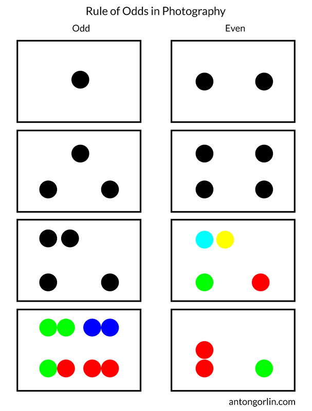
I know, this last image will raise a lot of questions. The main idea here is that if you can visually group elements, they become a single element. It depends on the actual picture and visual weight of the items in it.
BLOCK/UNBLOCK AREA
This rule is a bit related to the breathing space. Remember, it’s when you should leave an open space around the object without stuffing it near the edges. This rule is about creating closed (blocked) or open (unblocked) areas in the image. The two examples below show both. Open space allows the flow into infinity; the closed area keeps us inside of the area. The desired effect you want to achieve dictates how you need to compose a shot. Open space is optimistic and encourages us to get out of the current state, to move towards the future. The closed area is stable and dependable, and it prompts to stay and think, to recap.
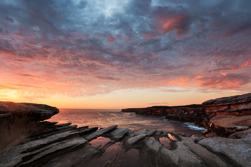
The wrong area type can ruin the shot. For instance, you have a dynamic and lively seascape with a rushing wave. The closed are in this case could choke it, stop and cut the action. Sometimes, this effect is not strong enough to actually ruin anything but it affects the mood, and you should consider it.
The ways to create a “closed” shot:
- The main lines end inside of the picture.
- The main lines enclose the area of the frame. It could be an arch or some other sort of enclosing.
- When the area is closed to start with, for instance, an interior.
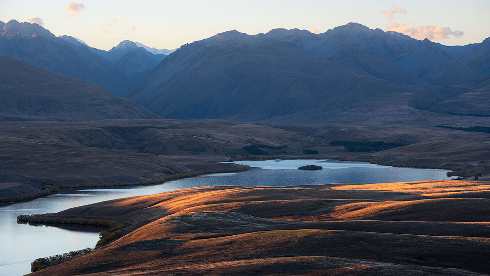
An open area encourages the viewer to travel beyond the edge, to elongate the image and to ponder about the unknown.
CONTRAST
One of the fundamental and most important techniques is to implement a contrast. It’s a very expressive method to have some conflict, some contrast between the objects within a frame. Some contrast examples would be:
- Light (dark/light objects)
- Colour (cold/warm or any opposing pair)
- Psychological condition (happy/sad)
- Physical condition (relaxed/tense, smooth/rugged)
- Part-to-whole relation.
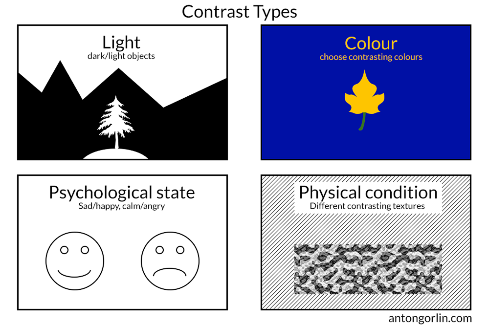
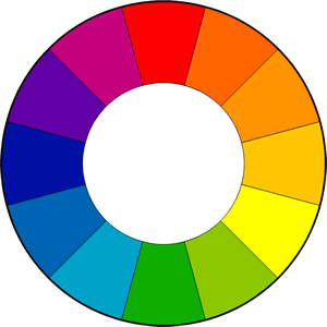
Regarding the colour contrast and colour theory in general – I’ve made a hard decision to leave it all out of this guide as it would add another couple of thousands of words to this guide having a quite distant relation to the composition. Colour theory may make another guide one day if the need arises. I’ll just mention one thing – the colour wheel so that you know which colours are making a contrast (they are opposite to each other on the wheel):
SUBJECT ISOLATION
The traditional perspective for the isolation is the shallow depth of field. This way the subject is separated from the rest of the objects around it. It’s widely used in the portrait, wildlife, and macro photography. You need to have the main hero in focus with everything else out of focus. The best way to achieve this is either open aperture on your lens or longer focal length or both.
This approach hardly can be applied to the landscape photographer. However, there is another implementation that we can use. The other ways to isolate an object are:
- Framing. Use some frame to separate an object from the rest of the world.
- Figure-To-Ground Relation. Use some sort of colour contrast on the background for the perfect isolation.
FRAMING
You need to find something that could form a frame around your main subject. You can use cliffs, tree branches, keyhole, broken fence, anything. It adds another dimension to the photo and adds context. Frame within frame gives an extreme accent to the centre. Also, more often than not, this type of composition works excellent with symmetrical shapes and central composition.
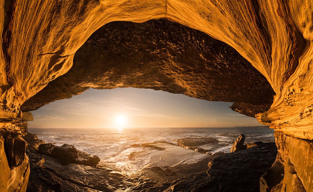
FIGURE-TO-GROUND RELATION
I could explain the whole concept with just a single image:
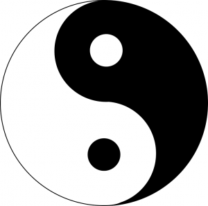
Just how easy is it to see the white on black and the black on white? That’s all about the figure/ground relation. To make the main subject stand out, we need to separate it from the background.
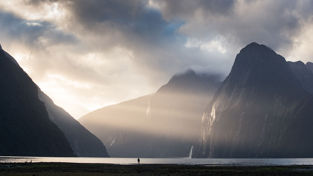
You can use either of the methods from the Contrast chapter plus a new one: Sharp/blurred condition. The most commonly used way is to blur the background. However, I’ve seen good examples with the blurred foreground. Especially, in reporting. With this type of separation, you may still need one of the other types to have the best result.
REPETITION
The repetition is obvious. Something is being repeated over and over again, like a row of marching soldiers. The repetition typically consists of the same elements. Our eyes tend to follow the lines and rest while browsing such photos. However, simple repetition is relatively dull. It may work well for some interior picture, which serves to create atmosphere and shouldn’t take a lot of time to contemplate. It also works well as a subsidiary technique complementing the other elements in the picture.
RHYTHM
I must admit, I stumbled upon this topic and was stuck for over a week. I’ve browsed numerous articles and books to no avail. The vast majority of material passing a repetition off as a rhythm. Of course, that is true but at an elementary level. It’s so much more than this!
ACOUSTIC RHYTHM
We are not used to seeing and understanding visual rhythms beyond apparent repetitions. Therefore it’s easier to explain in other terms. Imagine a piece of music made up of a single beat repeated over time, same beat, same silences in between. Does it sound like music? Does it sound any interesting at all? It’s boring.
Let’s make it a little more interesting. Make every third silence twice bigger. It becomes rhythmic instantly! Now modify one of the beats to be different, we now have two rhythms at the same time. It’s easier to understand than to explain.
RHYTHM DEFINITION
Simply saying, the rhythm is a recurring pattern of elements differentiating by strong or weak elements or varying conditions. This definition means, to form a rhythm, you need something repeating over time, and the repetition itself should create a pattern. You can build multiple rhythms in a single shot, and that makes a photo even more interesting.
RHYTHM IN PHOTOGRAPHY
For example, a simple repetition of lines is a very sketchy rhythm. A repetition with decreasing length is already more appealing than a bunch of similar objects. Another modification to the initial example of repeating lines is to add a few longer gaps (also repeated over some intervals). Think of it as music. Would your pattern form a nice sounding beat?
The rhythm shouldn’t be overly graphical and have exact shapes and sizes. The objects could have same direction (trees) or colours (berries in the field) or shapes(shadows). The eye should be able to perceive the resemblance and easily extend a visual pattern beyond the photo frame.

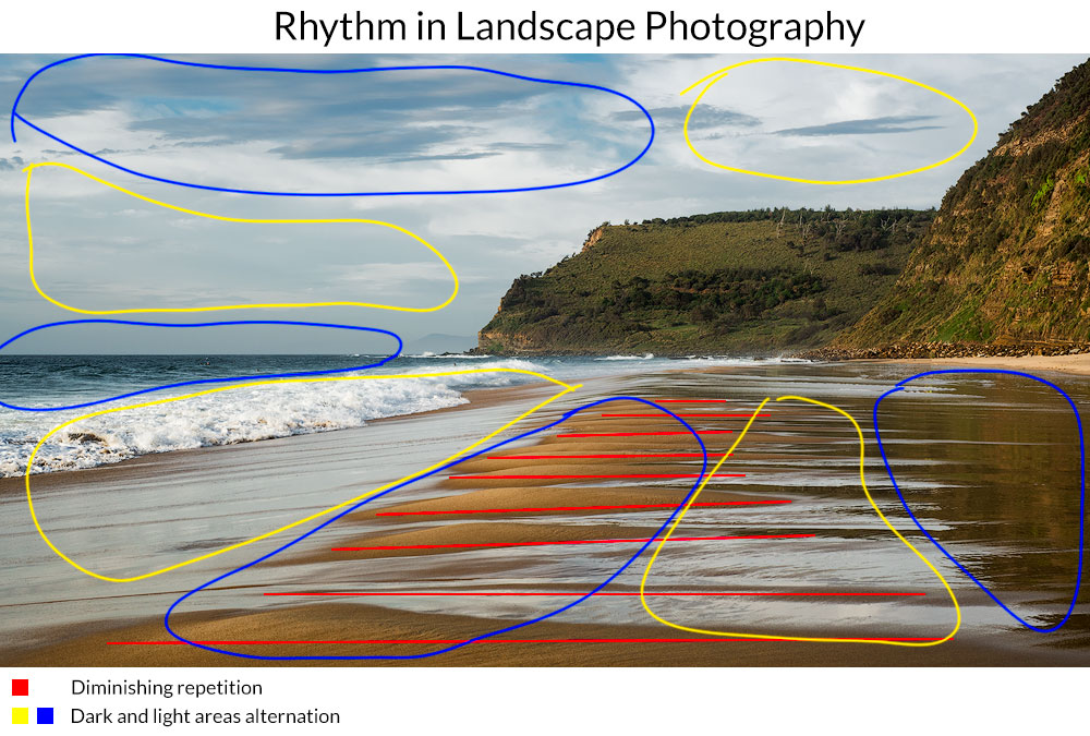
You can build a rhythm around the lines, objects, groups of objects, colours, tones, flares, light and dark areas, etc. Anything goes. Rhythm is a repetition that encourages the eye to move in a particular direction.
BREAKING THE RHYTHM
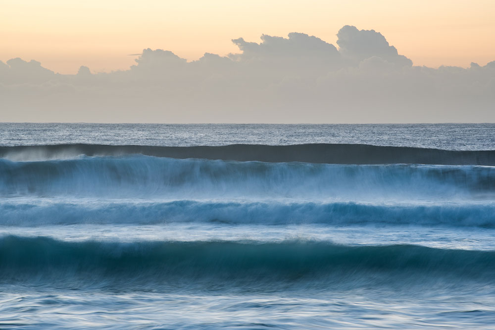
Sometimes we can incorporate our main subject into the rhythm, or it can itself be the rhythm. In other cases, we have some other type of subject, which is not strong enough to stand out. In this case, we need to break the rhythm to accentuate the subject. The other reason to break it is to draw attention to the imperfection or to make the viewer stumble and take a closer look at the picture.
DEPTH OF FIELD
The depth of field is a physical parameter of the photography process, and it dramatically affects your final shot. The general rule says that whatever you have in focus is the most important part of the photo, the blurred part makes a context or adds a nuance.
The usual approach for the landscape is to have everything in focus. For the portrait, macro, etc – the have a background blurred. For the landscape, however, sometimes it makes sense to have the foreground blurred to increase the sense of volume. This little trick is often used in cinema, for example.

LINEAR PERSPECTIVE
The converging lines create Linear perspective. Our brain knows that they are parallel in reality, but they seem to point to a single vanishing point in the distance. In landscape, it’s the horizon. And such effect forces us to perceive the picture as three-dimensional. This type of perspective is the most natural and prominent and easy to create. The further the starting points in the picture are, the better effect it produces. I.e., two lines starting at the bottom edges are stronger than those beginning near the middle of the bottom edge.
Another trick to enhance linear perspective is to include similar subjects which go into the distance. Their size decreases, and we perceive it as depth.

TONAL AND AERIAL PERSPECTIVE
The way we perceive the reality is inevitably connected with masses of air between our eyes and different objects. The atmosphere is never wholly transparent hence it affects distant objects more than those closer to us. Often, people tend to mix up things and make tonal and aerial perspective synonyms, which is incorrect.
The perspective has following properties:
- The clarity and sharpness gradually decrease with depth.
- The saturation also decreases and the colours whiten with distance.
- The contrast fades and softens.
- The objects in the distance seem to be lighter than those on the foreground.
So, the less saturation and clarity the objects, the further away it seems to be. The perspective instantly adds volume to the photograph making it 3-d.
The pictures, where distant objects have the same clarity and saturation as the closer ones, could look flat and those objects would look closer than they are.
AERIAL PERSPECTIVE
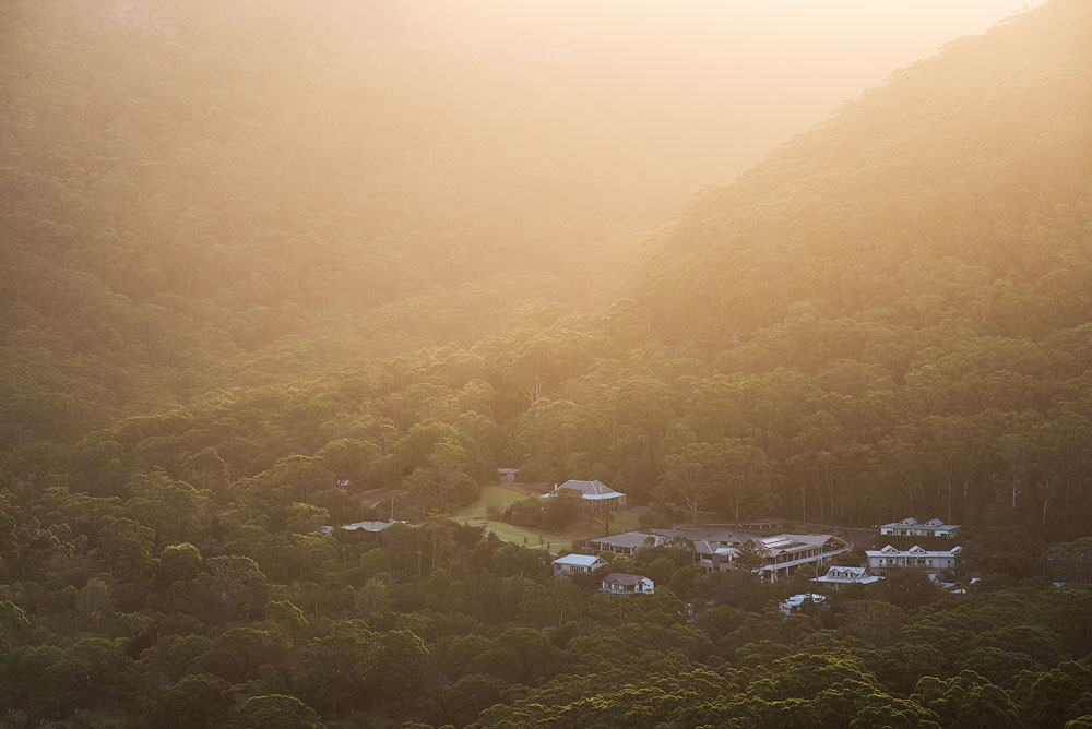
The worst light for revealing aerial perspective is backlight when the Sun is directly behind the photographer. The Sun brightens every object, and because solid objects have significant weight, they become much brighter than the possible haze out there, making it nearly invisible.
The best light is front light for it brightens the little particles flying in the air while most objects have their dark side pointed towards the camera. This contrast increases and the haze becomes more prominent.
TONAL PERSPECTIVE
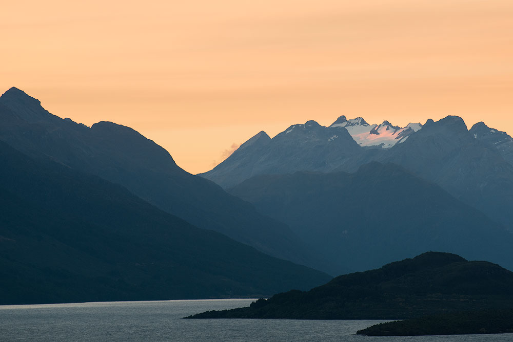
Let’s assume we shoot inside of the building or in a place with the limited depth of field. There is not enough air to produce any sort of haze. Or it can be a perfectly crisp and transparent autumn day. There is no way to have an aerial perspective. However, we can achieve the same result by using tones or colours. Put darker objects on the foreground and brighter objects in the background, and you immediately have a perspective. This is a tonal perspective, and also this leads us to the conclusion that aerial perspective is a sub-type of the tonal perspective.
HOW TO MANIPULATE PERSPECTIVE
| How To Strengthen Perspective | How To Weaken Perspective |
|---|---|
| Choose a point of view with distance visible | Choose a low viewpoint so that there is no middle-ground and the planes are disconnected |
| Use a wide-angle lens with a prominent foreground object | Use a telephoto lens from the distance |
| Use side light | Use front light |
| Include haze or fog in the distance, decrease saturation with depth | Equalise tones across the image, use UV filter to get rid of haze. Overdo Clarity slider. |
| Brighten image with depth, i.e., make the foreground dark, middle-ground brighter, the background even brighter | Equalise brightness across the image. |
PATTERNS
Just like the Rhythm, the pattern is based on repetition. The difference is that it does not encourage eye movement in any particular direction. It’s more related to the area it covers. The strong sides of the pattern are its geometry and continuation. If we cannot see the border of the pattern, then we assume it stretches on and on beyond the frame. The further away we move from the pattern element, the more they visually blend up until that moment when we can no longer distinguish each element. At this time they become a texture. So, for the pattern, we must be able to separate a single item from all others, and there should be some repetition. Typically, the objects should be grouped close to each other to form a pattern.

BREAK THE PATTERN
There is a way to accentuate one particular object among all others. For this, we should break the pattern. You can do it in many ways. Use a different colour, size, alignment, anything that goes out of order with the rest of the elements in the pattern. And such imperfection immediately drags attention to the rebel.
COMPOSITION BUILDING BLOCKS
Ok, now it’s all clear what’s the final shape and composition to pursue. But how to build it? What are the building blocks? In this chapter, I will outline the building blocks of the grey give some examples and hopefully give you some new ideas and gotchas.
Important: you can easily combine elements and use various building blocks within a single composition.
SOLID LINES
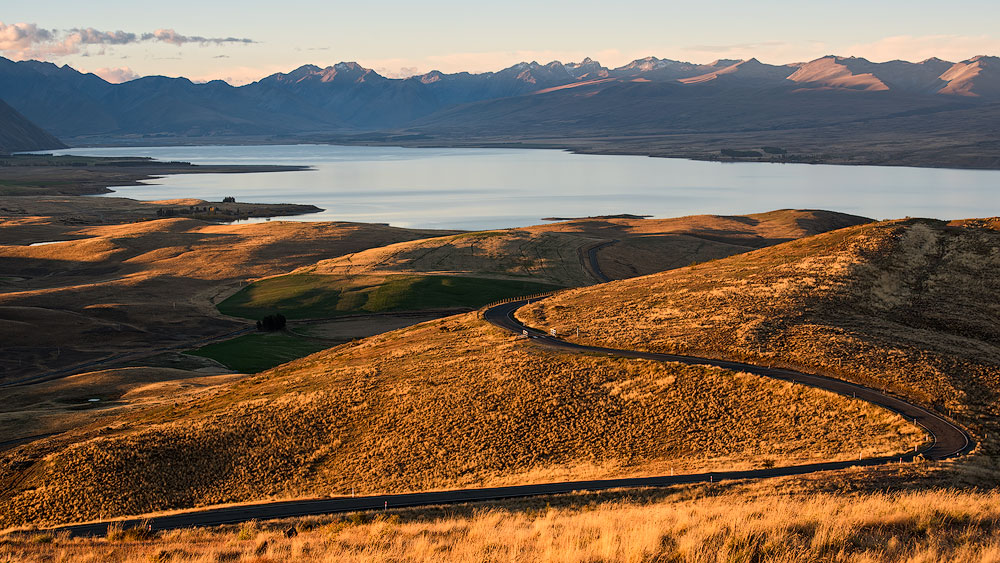
The most obvious composition element is a solid line. It can be anything – a wall, a rock, a crack, a tree. Anything solid and continuous. Due to the perspective, parallel lines converge at infinity, so, any parallel lines form diagonals in the photo.
SUGGESTED AND BROKEN LINES
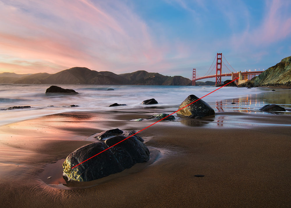
Unless you have an OCD for perfection, you can efficiently use suggested or broken lines. As we know from the elementary maths, there is only one possible line between two points in space. I know this, you know this, our eyes know this. We tend to find patterns and regularities and imagine them where we can’t find any. When we see two objects, we draw an imaginary line between them. Where there are three objects, there is a curve or a triangle.
DIRECTION USING SIGHT/MOVEMENT
There is a convenient trick, which is somewhat related to the suggested lines. If there is eyesight or a prominent movement, our brain tends to prolong and extend it. So, eyesight or a movement form very strong composition lines. It’s even strong enough to connect planes or form a diagonal. One important note here is to give enough breathing space for the direction of the eyesight.

If, for instance, a person moves or looks towards the edge of the frame, it causes depressing feeling, sadness, hopelessness. Feels like a dead end, end of story.
VISUAL MASSES
As I have already said in the Balance section of the article, the fundamental balance elements are visual masses. In fact, anything on the photo resembles some visual mass. Unlike regular mass, it’s much less related to the weight. It’s more about the prominence and visual strength.
- Colour saturation. The saturated area carries more weight than a pale one.
- Contrast. Black on white and white on black is an area of importance and stands out. Anything goes, any bright or dark areas. The further off middle grey, the more weight it carries.
- Solid objects. Any arrangement of points carries weight. The bigger the object, the more significance it has.
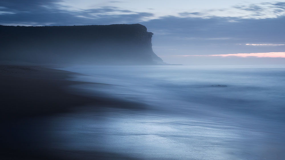
Feel free to use any combination of these elements to create a balanced or an unbalanced shot.
SHADOWS
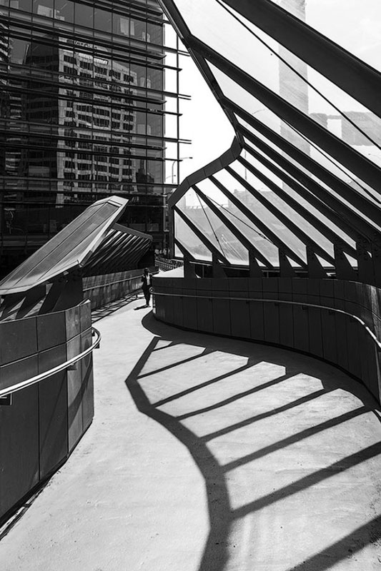
Another prominent feature, which can build the whole photograph or create some strong lines is a shadow. It particularly relates to the long shadows. Those you can see in the morning or evening. Shadows are intriguing by themselves and being dark they make a decent visual weight.
СOLORS
Colours or I’d rather say coloured areas make one of the fundamental building blocks of modern photography. A saturated area is stronger than a less saturated one. Halftones connect various regions and create a smooth transition between them. However, saturation is the easiest thing to overdo and ruin your shot. I prefer to de-saturate all colours except the main one (or two if there is a contrast in place). Such area makes a logical and natural accent for the whole frame.
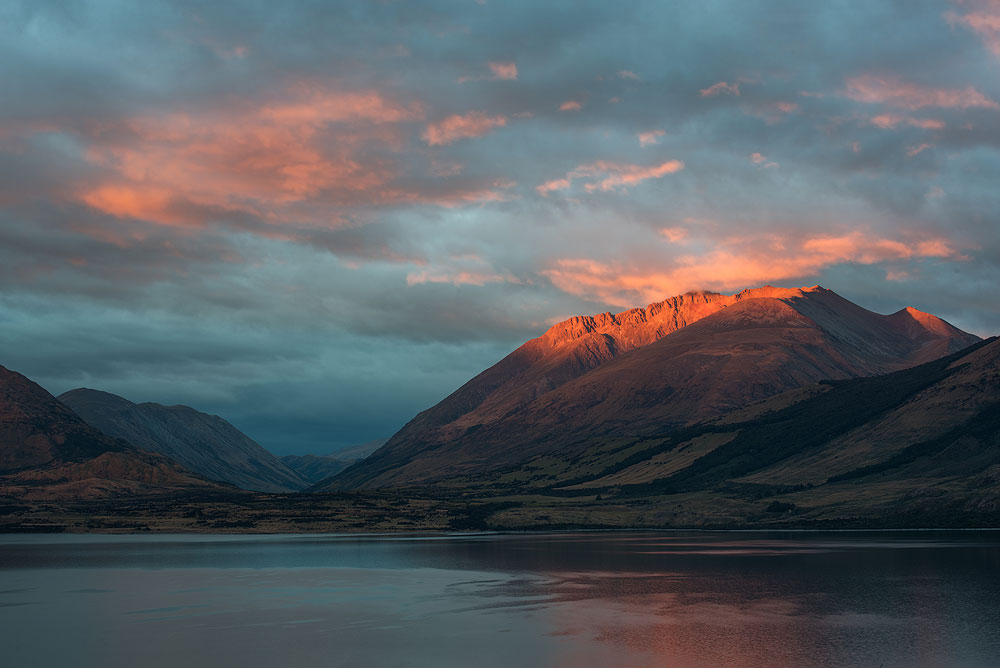
Colour is also one way to break the pattern or the rhythm or to bring in a new mood.
BRIGHTNESS AND CONTRAST
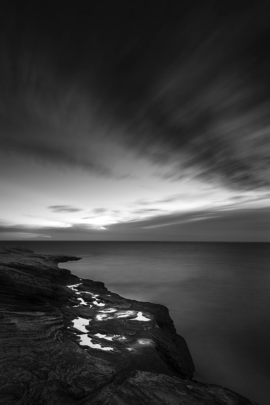
Not every photo is coloured. Many images are black and white, and some are just muted. So you can’t always use colours to build your composition. This issue is easy to fix as the coloured areas are only a subset of the other type – high contrast areas. Any high contrast area drags attention. It works both for bright and dark tones as well as area edges.
FACES AND FIGURES
A really small chapter here. Any face even being small, carries a psychological weight for us, the humans. We can easily extend this concept to the whole figure, and it works equally suitable for both human and non-human characters. Take this – any living shape brings more visual weight and meaning that equal non-living one.
TEXTURES AND PATTERNS
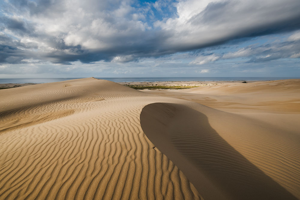
Last but not least textures and patterns can also serve as building blocks for the composition. Typically, they do not have any direction. Therefore they are great for the foreground. They create fantastic pleasing for the eye areas and can keep the viewer busy for some time. The pattern works equally well for other parts of the photo, for instance, for the sky.
In short, a pattern is appealing for the eyes and keeps the viewer’s attention longer than any other type of the elements. Typically, the pattern or the texture lacks dynamism and movement, so it should be used in conjunction with other composition building blocks.
HOW TO CONTROL AND AFFECT COMPOSITION
There are specific parameters, which significantly affect the composition. I believe I have already mentioned all of them in the article, but this is important enough to write a summary for better understanding.
FOCAL LENGTH
Focal length is the first and prime thing to decide before even taking your camera out. Different focal lengths have a different visual effect.
| Ultra-wide | 0-24 mm |
| Wide | 24-35 mm |
| Normal | 40-58 mm |
| Telephoto | 60 mm + |
WIDE-ANGLE LENS
The wide-angle stretches it and exaggerates the foreground. It is a commonly used general approach to have such lens for the landscape photography. If your photo is about the vastness, about the relation of the foreground to the background, about the scale, then you could use a wide-angle lens and produce photos with a “wow factor” and a sense of scale. This type of glass is less frequently used for other genres of photography.
TELEPHOTO LENS
It’s very limiting for a photographer to own just a wide-angle lens even for the landscape/travel photographer, and I urge you to have some longer lenses too. The telephoto lens squeezes the perspective and distance, making it less stretched, forming a tighter image where all objects seem closer to each other.
If your subject is distant or the tonal perspective only appears in distant objects, then it’s a good idea to use a longer lens.
NORMAL LENS
Standard glass is anywhere in between and offers the most versatile range of possible compositions.
There is no right or wrong choice here as everyone would have a different vision and approach to the photography. If you are just starting out, get an all-in-one lens and give it a go for half a year. Then look through your photos and take notes of the focal range used.
ADD A HERO
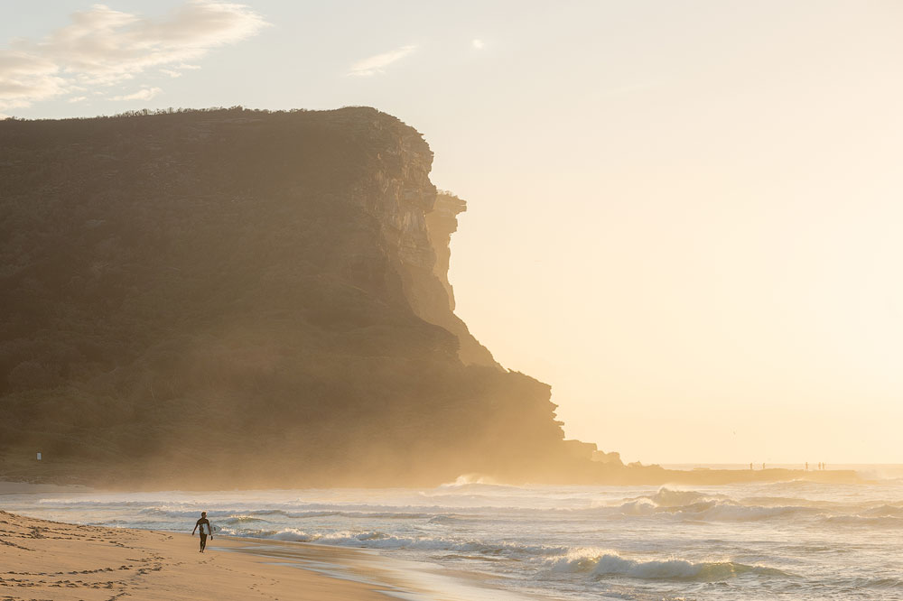
Adding a story hero help a lot. It immediately starts to convey a story, to bring a sense of scale, to emphasise figure-to-ground relation. It’s doing a lot of things and improves the overall look and feel. This approach applies to the landscape (add a human or an animal), to nature (add a single fallen leaf), to the still nature, to the macro, to anything. A little nuance changes a lot.
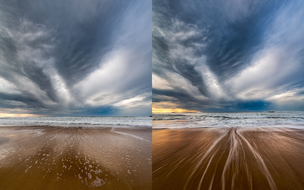
LONG EXPOSURE
Long exposure surely affects a composition. It’s able to smooth out the clouds turning them into the lines, to flat out unrest seas turning them into the fog, blur the mob turning them into the impressionist conglomeration of the shadows, create the star trails, etc. There are numerous ways to implement and change the overall structure of the shot. Keep it in mind next time you are out there in the wild.

POINT OF VIEW HEIGHT
Consider also the point of view, i.e. the height of your camera during the shoot. It may affect the composition and change the shapes of the objects. Also, it changes look and feel of the photo.
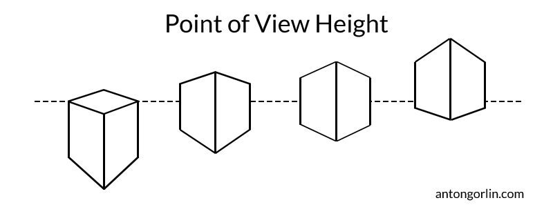
Psychologically, the towering object seems larger and more prominent. However, the lower position hides the middle-ground thus decreasing the prolongation effect going from the foreground into the background. The very low position will detach layers of the photo from each other. So, use the lower position wisely – it has an excellent expressiveness potential. It’s widely used in sport and landscape photography.
Pro Tip: Go really low for the wide-angle lens. It makes any land feature huge and prominent.
The higher point of view stretches everything between foreground and background, shows all objects on the level surface and makes a harmonious picture. However, it lacks a bigger punch of the lower point of view.
LIGHT DIRECTION AND QUALITY
It isn’t obvious for the newbie, but the light itself is the crucial factor in your composition. And especially it’s direction.
The side light is the best – lighting the objects on the angle, it reveals all structure and texture, produces light and shadow and adds a lot of volume. The morning and evening light casts long shadows, which are great for the composition too.
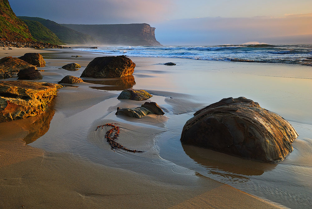
The front light has different properties. It’s harder to photograph than other types of light but it’s so rewarding. It lightens up haze and dust particles in the air producing the glowing filling effect. Such photos have the most magical look. Also, the objects show their dark side to the viewer adding to the overall tonal contrast. And lastly, all these objects could have a brightly lit edge.
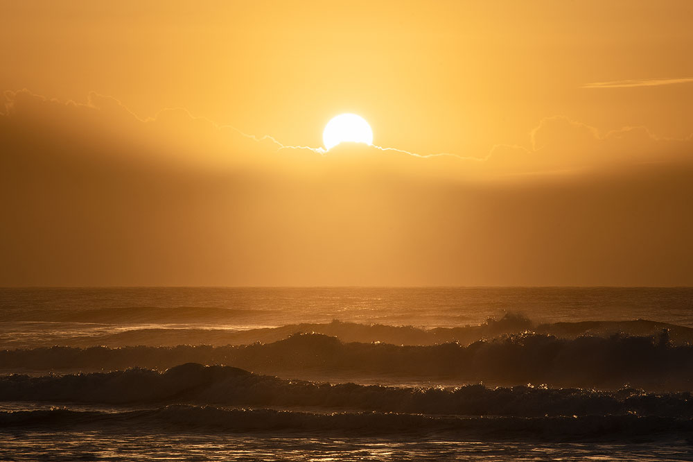
The backlight is the worst. First of all, it renders any haze much weaker, often making it disappear altogether hurting the perspective. Second, it fills all the shadows making the shot look flat like a kid’s drawing.
Another kind of light is the daylight when the Sun is up above. Typically, the photographers try to avoid it, but we could also make some use of it. Shoot the water without any solid objects (rocks, etc.) close to the camera. Include just the water and the sand and maybe something in the distance. It makes all those paradise shots.

HOW TO IMPROVE COMPOSITION IN EDITING
HOW TO CHECK COMPOSITION
There can be cases when you are not sure if your composition is prominent enough if it’s speaking to the viewer. There is a simple trick to check if it’s real or exists just in your head. Blur your photo heavily in your editing program. The significant lines, areas, shapes and colours should still be visible. All you composition blocks should stay and form the skeleton of your composition.
PHOTOSHOP CROP TOOL
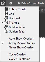
You probably know about the crop tool in Lightroom and Photoshop. But not many are aware of the hidden composition assistant grids it contains. Once you select a crop tool, there is another button on the tool strip at the top. It includes a range of grids for your composition. Select a different grid from the drop-down menu or by pressing O on the keyboard. Some overlays are not symmetrical and to change their orientation, please press Shift+O.
BONUS #1: DYNAMIC SYMMETRY – MYTH OR REALITY
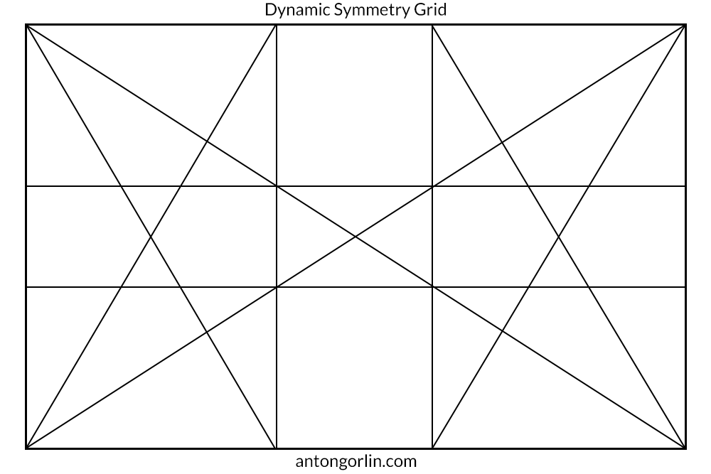
I’ve seen a large number of articles and books about the dynamic symmetry. There are even sites dedicated to this topic in full. All these materials claim that most of the known composition rules are either nonsense or simply inherit the dynamic symmetry principles. In short, this composition is based upon a large number of major and minor diagonals forming various grids and pretty patterns. Also, some of the articles claim that the classic painters like Leonardo da Vinci used these laws in their works. After some research, I must say that’s total nonsense. Leonardo lived more than 500 years ago, and Dynamic Symmetry principles were formed by Jay Hambidge (1867-1924). Surely, Leonardo and others used diagonals and gestalt principles, but it has nothing to do with those nice grids and modern theories. With all that said, I’m not implying the theory is wrong. It could be right as an arranging principle as it uses lots of diagonals and is based upon the same principles.
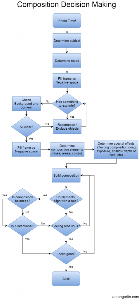
BONUS #2: COMPOSITION DECISION-MAKING FLOWCHART
Disclaimer: this flowchart shows how my brain works (more or less). I’m not saying it’s perfect or even correct. But I thought it could be interesting and helpful to my readers.
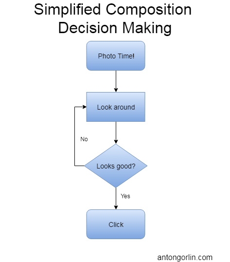
BONUS #3: SIMPLIFIED COMPOSITION DECISION-MAKING FLOWCHART
I know many photographers who use another workflow. It works just as good sometimes, especially when you have a good eye for the composition!
FINAL WORD
I hope this article sheds some light and helps you to build the compositions better and faster and analyse other photographer’s works. The composition is not something you learn in the form of an insight or the “gotcha” moment. It needs practice and careful thinking and analysis. My best advice here is to take some rule and create a few dozens of photos with it. Repeat until you feel you’ve got that intuitive understanding of how it works. Then proceed to the next one. Level two is to combine some rules, etc.
If you enjoyed reading this article, I bet you’d enjoy reading an editing handbook I have created for avoiding the nastiest editing mistakes.
Please rate this article.

 (
(
No hay comentarios:
Publicar un comentario